
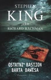
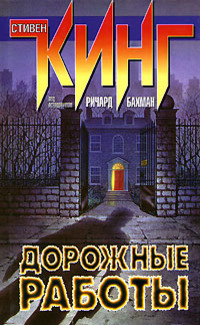
Roadwork was quite a good book but insanely slow and something very interesting happened only in the end. But what about covers?
Bulgarian editions:
Bulgarian editions:
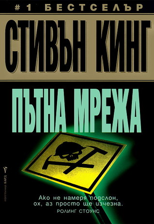
First one is just too plain for me, too average, but in next to it the second one is really better. I like the colours because red, black and white makes awesome combination. And there is very nice drawing which makes me feel a little bit uneasy and that works very well for King's books.
Czech edition:
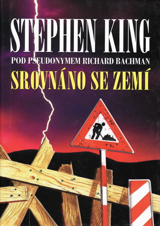
Another quite plain design even I like how they worked with colours, they just match together, and I like how it goes with book's theme.
Dutch edition:
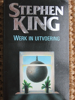
I don't like colours of this. Maybe if it would be only black and white it would be better, but the threatening vibe is awesome.
English editions:

Wow, lot of them have western style XD and that is not my cup of tea. But the last one is one of the best here. I like composition and toning of colours and how they creatively put book's name there. This cover is just awesome.
French editions:

First one looks like for some third-grade horror movie about vampires or other monsters and it quite don't fit. Second one is better even colours are quite dismatched for my taste and have weird tones.
German editions:

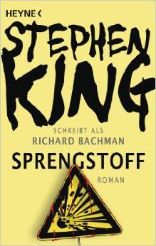
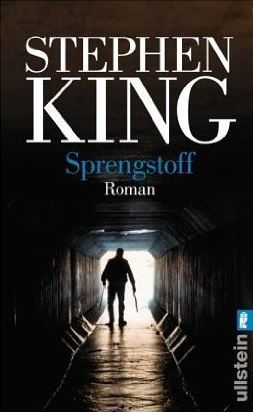
First one looks very amateurish and simple, like they didn't want to spend more time on it. I really like second one. It's the best of simplistic ones. Only two colours and picture which says a lot. This is my second most favourite. Third cover is good too, picture gaves me shivers but title is in bad colour almost lost here.
Greek edition:

Ok, it matches the theme but that big purple name is just horrendous.
Italian editions:

First one is quite interesting. I like its colours and that title with author's name don't strike the eyes. Second one is great. How they used colours, the theme of it, and title with name is nicely visible. Really good work.
Norwegian edition:

This one is just weird. If I would pick it up jost for the cover I wouldn't have idea what it is about. And colours are just in wrong tones.
Polish edition:
Another simple one which looks quite good. The dark atmosphere is really great. But sadly font is very plain and there is no creativity in it.
Portuguese edition:

Great colours and I love how they put name and title there. It just catch your eyes.
Russian edition:
Another awfully colourful one which has very bad horrorish vibe.
Spanish editions:

First two are quite same but second is better done. Colours, creativity and font is likeable. Third one is best of these. There is similarity to the second one (background) but it's more darker.
Swedish edition:

Quite nice and simple but there is no need for more than three colours if it is like this.
Turkish edition:
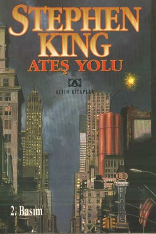
Quite don't understand this one. Why skyscrapers? And there is too much colours for me and it's very chaotic.
So, which one do you like the most? And why?
No comments:
Post a Comment